
Creating an Online Service Desk for Registry Offices
Overview
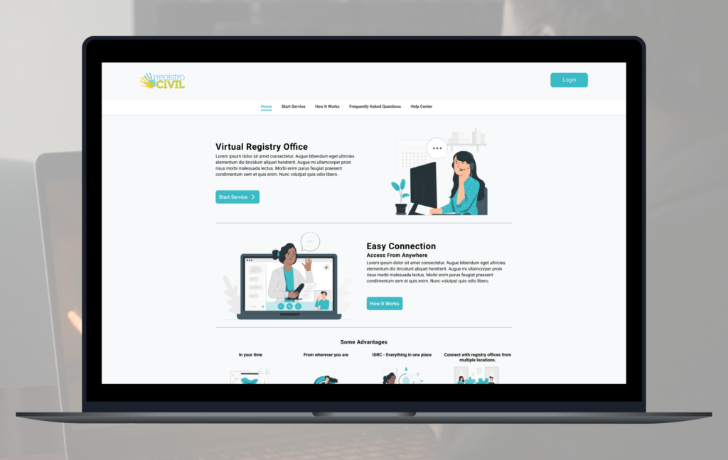
“Balcão Virtual” is a proposal for a new service for registry offices, which citizens can request a service without leaving home.
Role
I was responsible for strategic design decisions and the end-to-end creation of the solution, from research through to delivery.
Summary
This case study explores “Balcão Virtual (Virtual Counter)”, a proposed digital platform designed to allow citizens to access notary services remotely, without the need for an in-person visit. The project was created to make these services more accessible and convenient by reducing the physical and accessibility barriers associated with traditional service channels.
The solution includes a citizen-facing experience for joining and tracking a virtual queue, as well as an administrative interface for managing queues and configuring service schedules. The case study covers the research, information architecture, wireframing, and prototyping process, with client approval and alignment on project scope used as key indicators of success.
The problem
Currently, majority of customer services are offered in person at the registry offices. The challenge is to provide service wherever the user is, expanding the ways users can access services and helping break physical and accessibility barriers.
Goals
Design a seamless digital service journey that simplifies remote access for citizens while enabling notary offices to efficiently manage service demand and staff availability.
Research and ideas
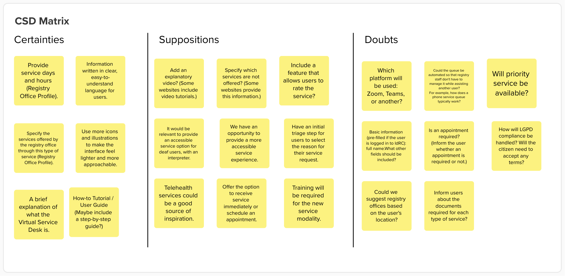
We began by consolidating what we already knew about the project and identifying gaps in our understanding. Working with stakeholders, helped us validate assumptions, clarify open questions and establish a clearer foundation for the design process.
After that, we began desk research. We focused on existing online services, such as the Superior Court of Justice and companies that offer videoconferencing as part of their services or customer support.
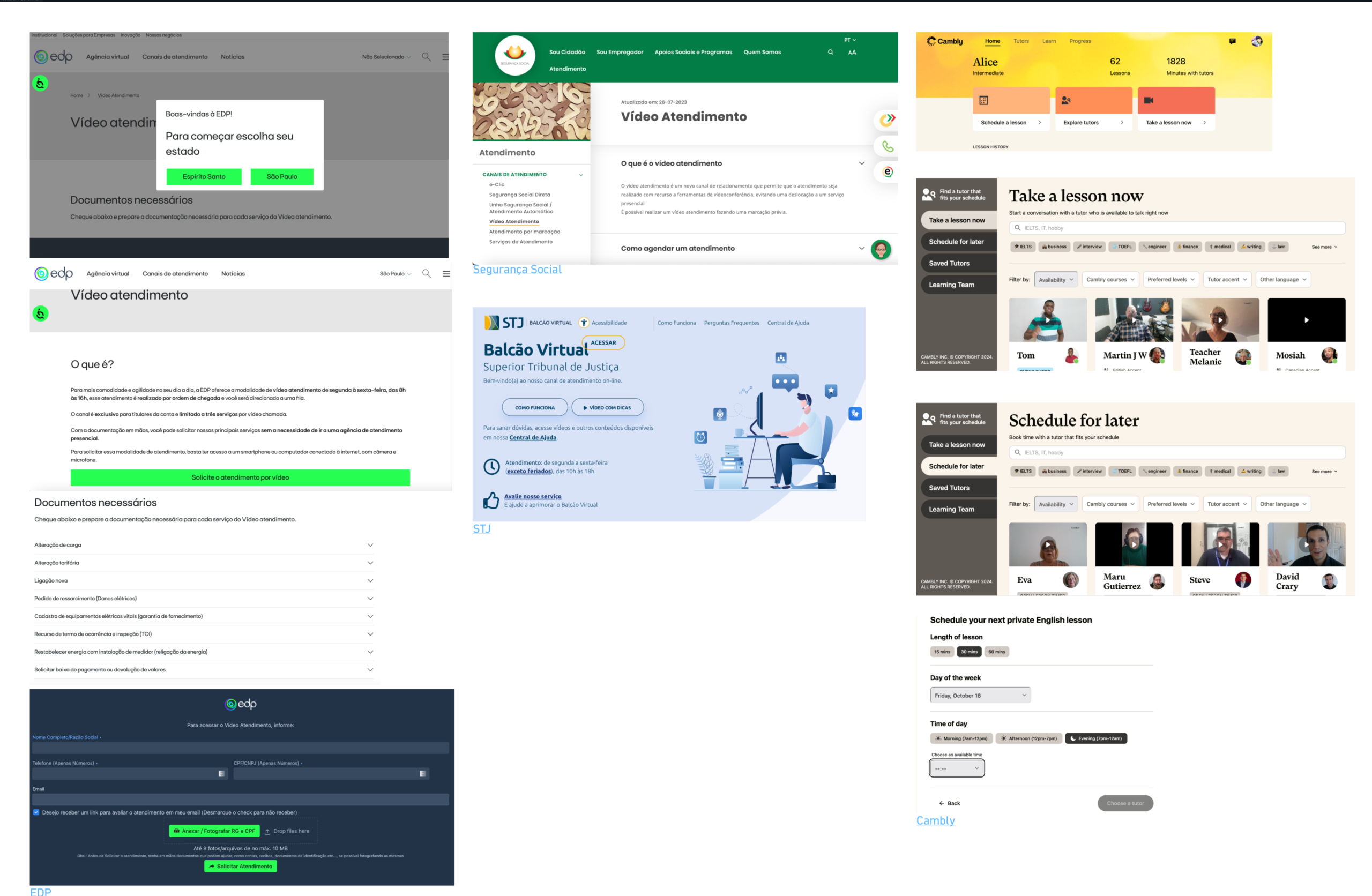
A few patterns stood out across the services we analyzed. Many provided clear information about service hours, instructions on how to access the service and options to find or filter virtual assistance based on the user’s location. These elements helped set expectations before starting an appointment and made the remote service easier to navigate.
These findings informed our solution by highlighting the importance of providing clear service availability, guidance and access information throughout the journey.
Solution
A platform that allows notary offices to provide virtual services through a video-conference room.
The idea is to offer an area where citizens can access the platform and join a virtual queue for a specific notary office, as well as an administrative area where each office can manage its service queue and configure its virtual desk by setting operating hours and the number of available attendants.
Functionalities and Priorization
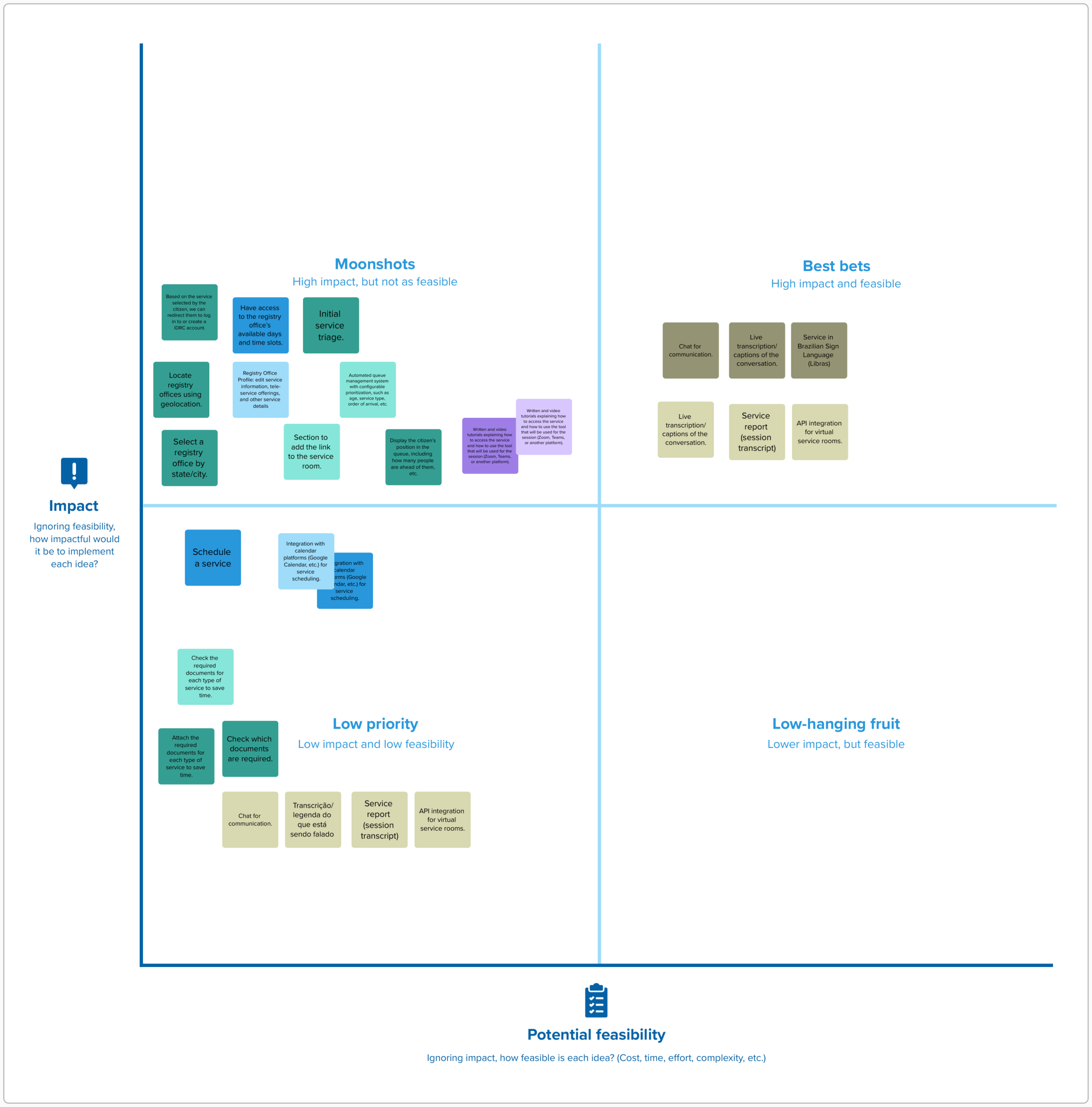
We wrote some functionalities that can be useful, which user and in which situations these functionalities can appear in. For example, written and video tutorials explaining how to be assisted and the features of the tool that will be used for this service that user can find on some helping page on the website.
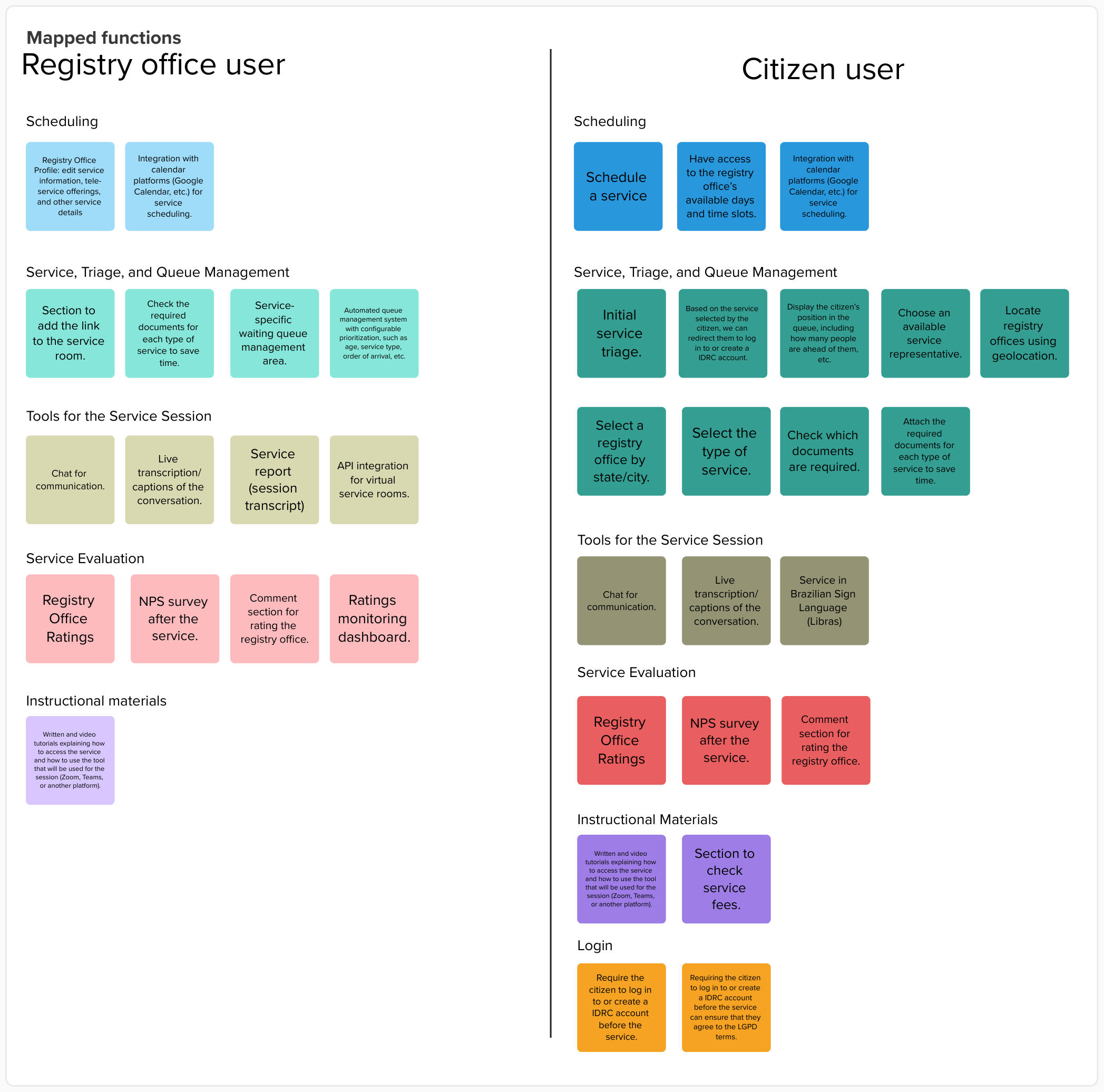
Afterwards, we measured the proposed functionalities by comparing their potential impact with the effort required to implement them. Together with the Product Manager, we discussed the findings, evaluated trade-offs and aligned on the priorities based on user needs, business goals and project constraints. This process allowed us to focus the solution on the features that could deliver the most value.
Information Architecture
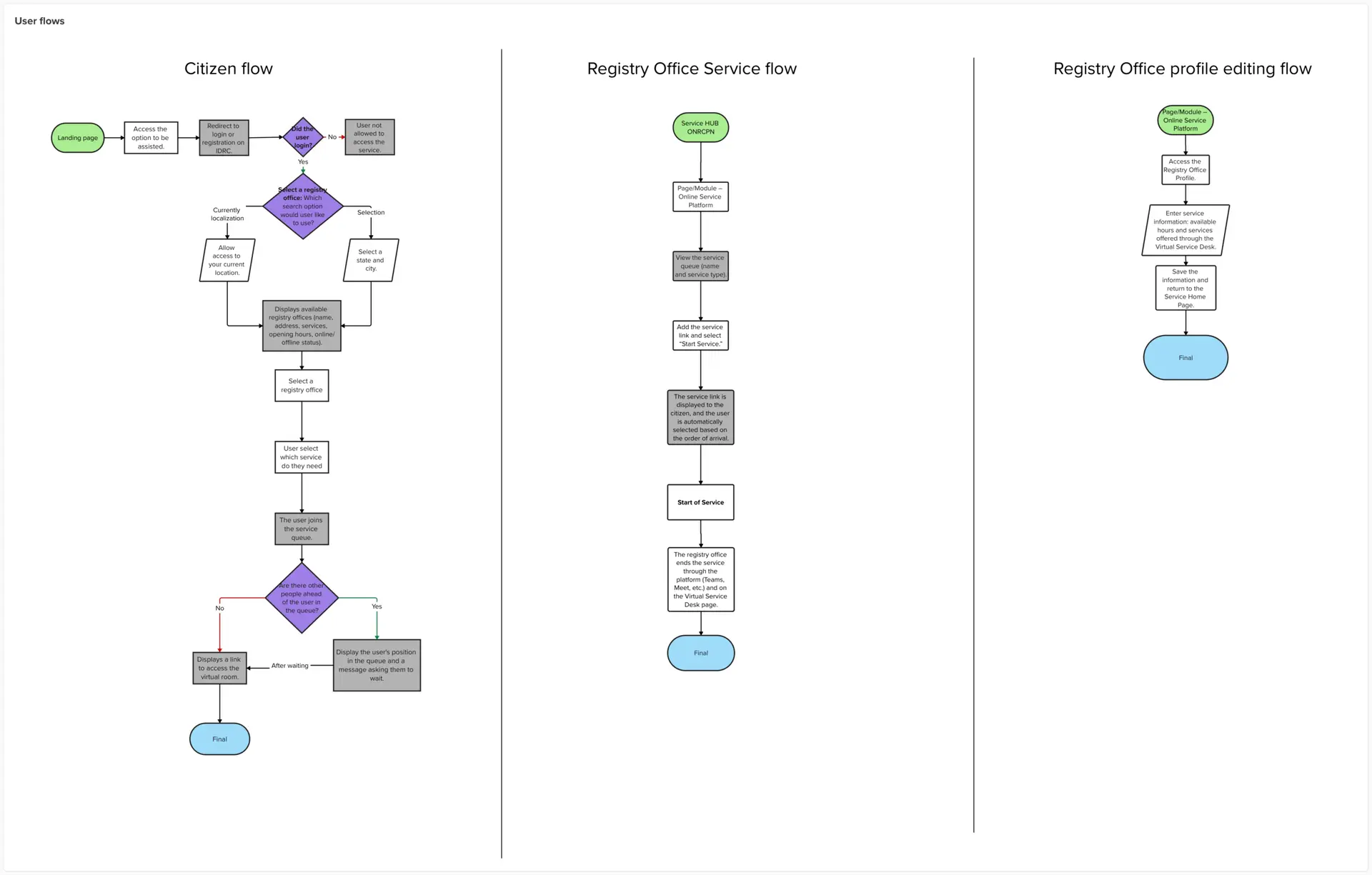
We had to create 3 user flows: for citizens, for the registry clerk when they assist them and for the registry clerk when they have to adjust the system settings.
Wireframe
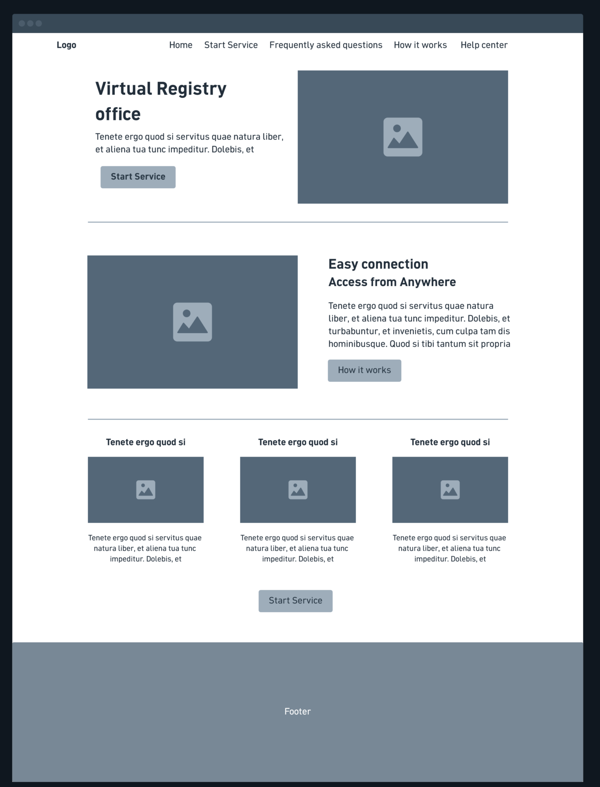
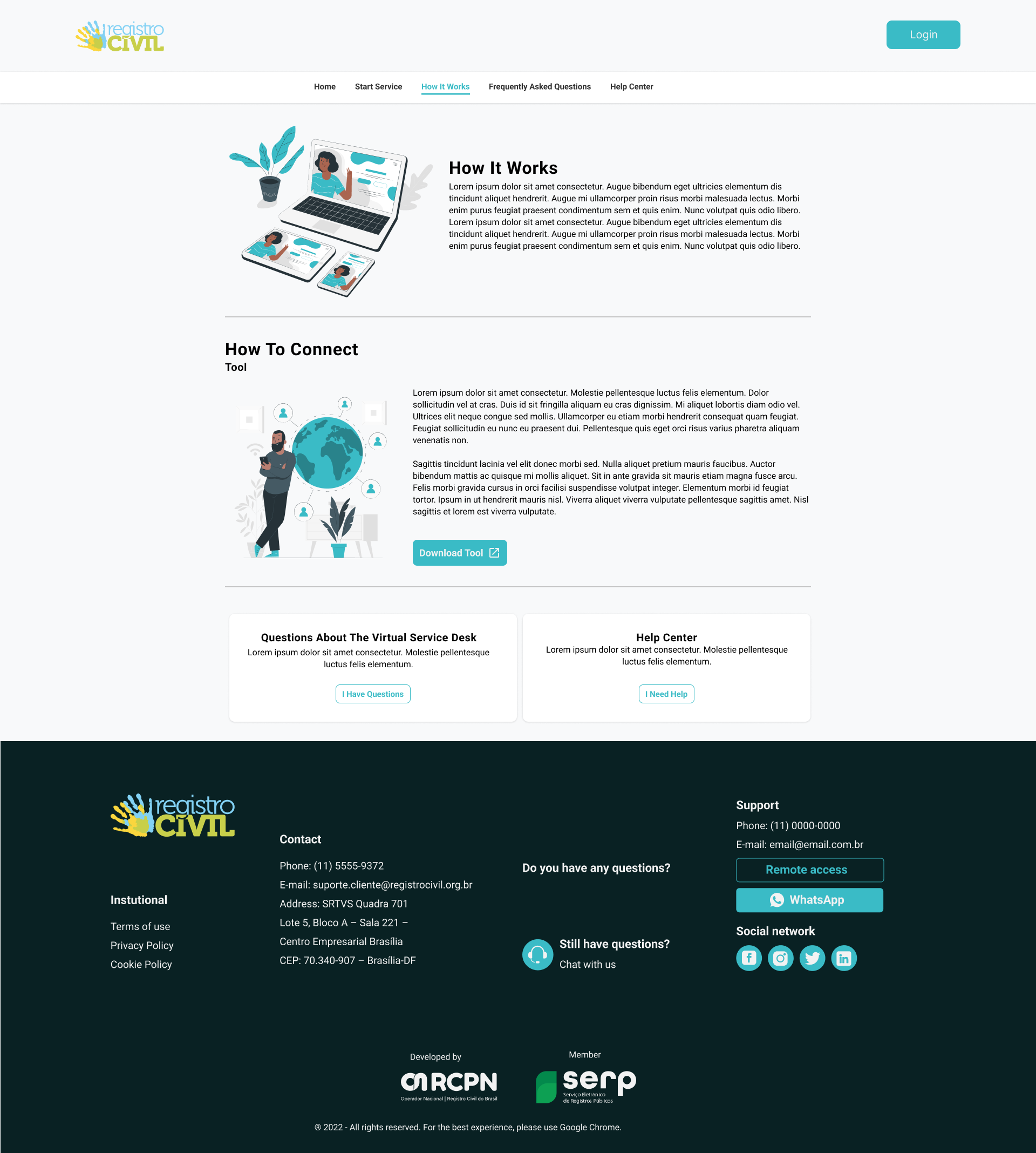
I brought some of the prioritized functionalities into the initial landing page structure, focusing on the key questions a user would have at the start, when arriving at the service: What is this service for? Where do I start? Where can I get help?
The landing page was designed to quickly communicate the purpose of the Virtual Counter and help users understand how they could access its services. From there, the structure provided a clear starting point for the main journey while keeping guidance and support easy to find for users who might need assistance.
I used the wireframes to explore the hierarchy and flow of information, iterating on the structure before moving forward with the visual design.
Final UI
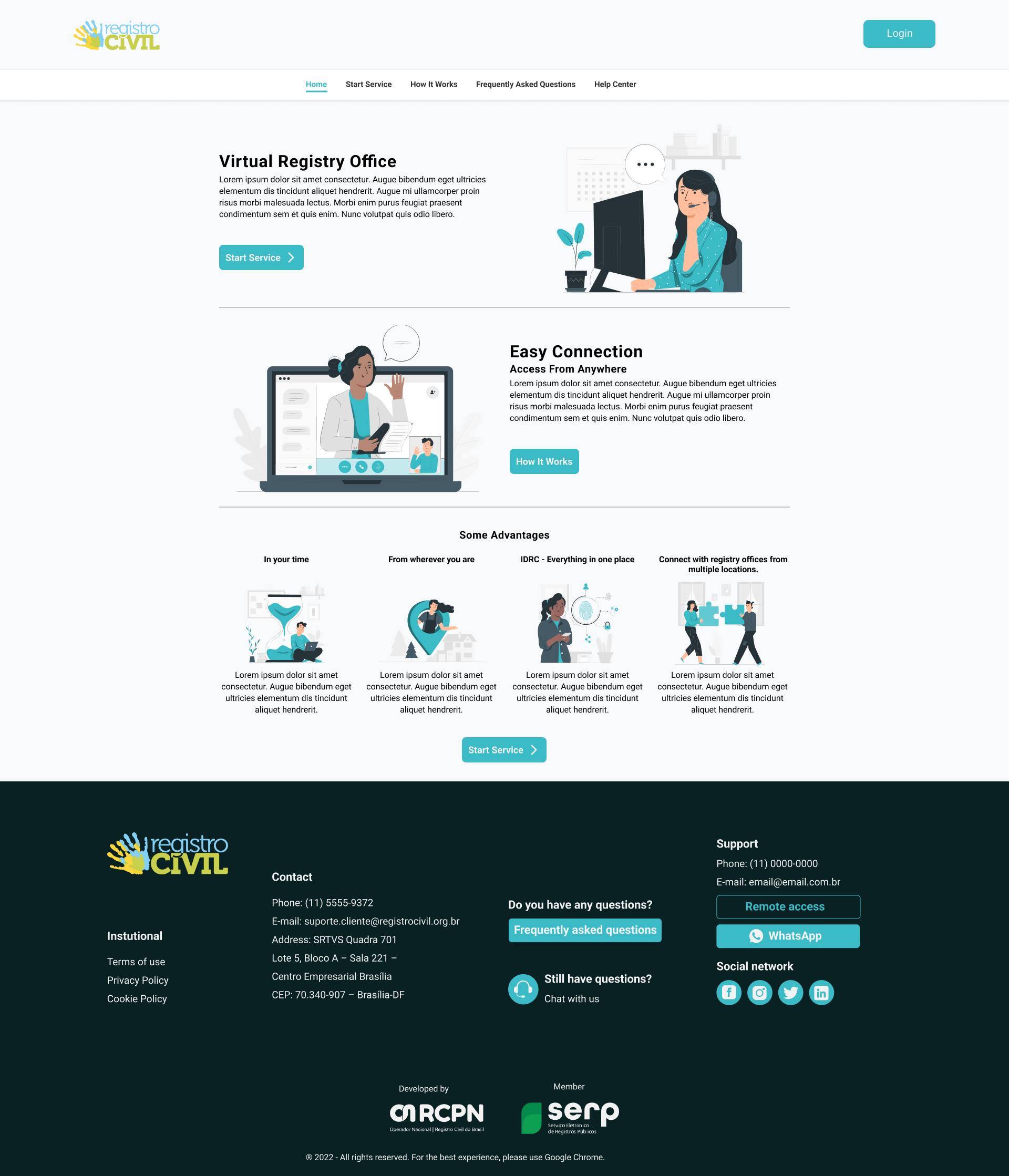
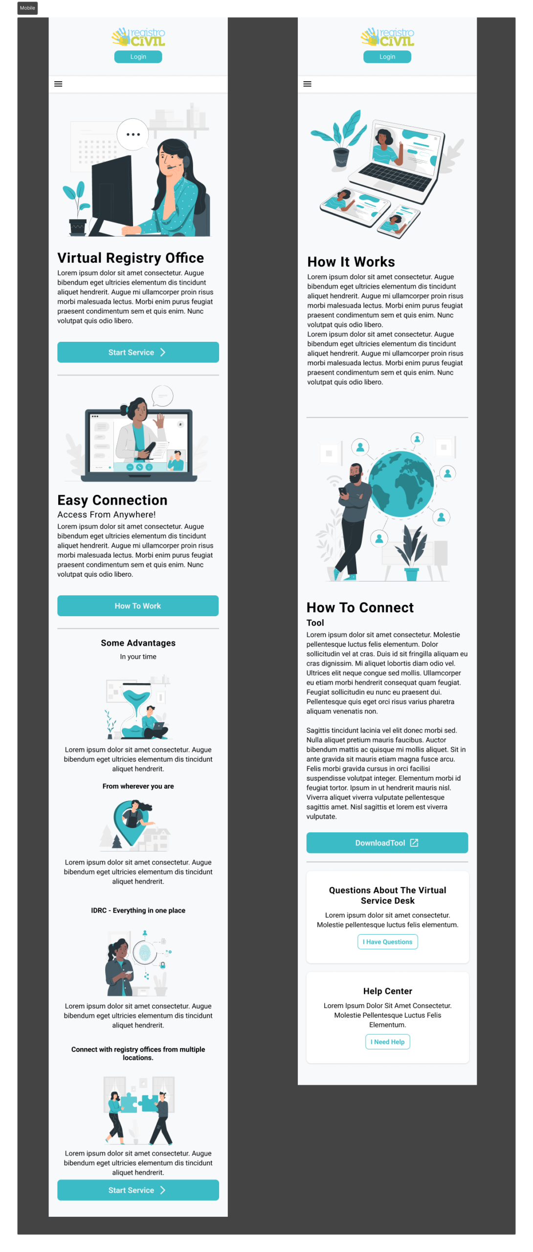
With the structure established through the wireframes, I developed the final desktop UI, applying the visual direction and refining the hierarchy, layout and interface elements. A second designer worked on the mobile version in parallel, with both layouts following the same core structure and visual principles.
Validation
No formal user testing was conducted. Validation focused on internal reviews and stakeholder discussions, helping us refine requirements, clarify the scope and align the solution with the project objectives.
Results
The project resulted in an approved concept and prototype that provided a foundation for future development. As the project was later put on hold, there were no post-launch metrics or user outcomes to measure.